Chicagoisms

Chicagoisms aims “to revive Chicago’s constructive potential and spark a renewed boldness to engage the city today.” If only we were given the opportunity to actually engage! Though ripe with good intention, Alexander Eisenschmidt’s five Chicagoisms —Vision Shapes History, Crisis Provokes Innovation, Ambition Overcomes Nature, Technology Makes Spectacle and Optimism Trumps Planning, lack the gusto to inspire.

The introduction panel provides the bulk of the text where several sweeping claims are made. First, the exhibition is a survey of Chicago’s urban history. Curiously, there is a large gap of time unaccounted for under each –Ism from Chicago’s incorporation to present day. In “Crisis” the most recent photo is from 1910, “Vision”1965, “Ambition” 1975, “Technology” 1969 and “Optimism” 1973, suggesting Chicago’s design influence is at a stalemate.

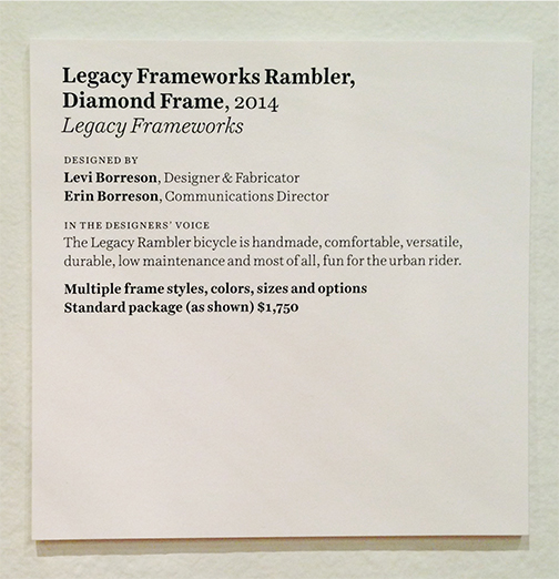
The exhibition additionally claims to provide contemporary interpretations through nine architectural models and manifestos presented successfully in response to selected –Isms. Each model is situated among historical examples. Under Ambition Overcomes Nature, a proposal for a 10,550 mile long aqueduct around the Great Lakes Basin by UrbanLab is likened to the reversal of the river. In Crisis Provokes Innovation, Port A+U shifts Lake Shore Drive east onto a man-made extension along Lake Michigan, doubling prime real estate and theoretically solving the financial crisis, similar to the rapid rebuilding after the Great Chicago Fire.

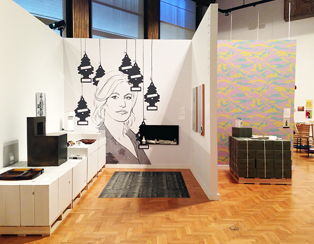
However the few glass-domed models amongst the abundance of black and white architectural photos of the past are only little presents, with little presence. A small show with big ambitions leave visitors questioning the innovative future of Chicago’s architecture.

Chicago DSGN: Recent Object and Graphic Design

5.31.2014 - 11.2.2014
Chicago Cultural Center

The party can be found at the top of the stairs of the Chicago Cultural Center. Magdalena Wistuba’s “Oscillabel” greets you with fragmented words “everywhere” and “everything” printed on little tabs of neon colored paper and dispersed throughout the Chicago DSGN logo like confetti, instantly setting the tone for an exhibition celebrating Chicago’s leading contemporary designers. 

The fun continues once you enter the gallery space. A three foot wide, teardrop-shaped net is suspended over a black folding table. It’s bulging with still more brightly colored pieces of paper that look as if they might be remnants from Wistuba’s installation. The colorful spectrum repeats on the floor tiles inscribed with “You Are Beautiful.” These works by Matthew Hoffman and You Are Beautiful Inc., respectively, contrast with Ania Jaworska’s “Monument for Them,” a nine foot narrow black sculpture with three vertical pillars whose more imposing shadow spells “hi,” literally welcoming you into the space.

Over 100 designers are represented by a good mix of objects and text varying in size, shape and medium. With so many different designers in the show, curator Rick Valicenti does a fantastic job at giving almost every one of them a voice. All objects, with the exception of a tapestry above the introduction panel, has a wall label, most of which include a portion called “In the Designer’s Voice.” Here, designers took the opportunity to describe either the context of their work or their design approach. In a show full of purposeful design, whether it’s advertisements, branding or furniture, the insight given into the objects’ meaning gives us greater appreciation for the final product.

The “Noun Project Projection” by Simple.Honest.Work. is a series of graphics that flashes with an associated word in the corner of the projection. Though I figured out what most of the symbols are trying to convey without looking at the specific word, when I read the words first, they did not always correlate with the image on the screen. More importantly, I didn’t understand the overall concept or purpose of what I was looking at. Reading the “In the Designer’s Voice” helped me understand. The text explained there are variances in written and spoken language, however symbols may be universally understood. The group’s goal is to “build a silent (global) language that speaks louder than words.”

Returning to Ania Jaworska, her “Voice” gives commentary to monuments and landmarks as signs of “cultural momentous.” Jaworska’s piece illustrates the power of meaning prescribed to sculpture depending on community, site and time. She strips these away from her “Monument for Them,” leaving a satirical account especially poignant in Chicago where many sculptural landmarks have become synonymous with the city’s identity. Perhaps it’s no coincidence that Valicenti places Jaworska’s work at the forefront of the show.

Valicenti himself is one of the leading designers in Chicago. Examples from his firm Thirst’s work are littered throughout the exhibition. Beyond my visual excitement from the colorful walls, prints and product, I found it increasingly difficult to ignore these bits of self-promotion. Valicenti’s own impact on the Chicago design community goes unquestioned, though I began to wonder what the qualifications and motives, if any, were of the selection committee for the 200+ pieces in the exhibition.

Further fueling my suspicions is the blatant price tag on the Legacy Framework piece. The “Voice” for this bicycle reads like a merchandise catalog: “This Legacy Framework bicycle is a handmade, comfortable, versatile, durable, low maintenance and most of all, fun for the urban rider,” with the starting price, printed in bold, given as $1,750. The display of this bike appears on the opposite wall of the Divvy bicycle with no mention of the membership fee; instead, the wall label focuses on the creation of the logo and its relation to bike lanes.

Other product juxtapositions highlight consumers, the main clients to these designers. Furniture giant Holly Hunt has several pieces in the show, all of which politely inform you in italics that you may “Contact showroom for price and availability: hollyhunt.com.”

Whether products are being advertised or not, there is a rawness to the custom displays they rest upon. Designed by Tim Parsons, these displays out of Styrofoam, wood and metal 2x4s, shipping pallets and stacked white cardboard boxes are a stark contrast to the refined objects adorning them.

One of the more honed displays is a ten foot table cleverly crafted of stacked square posts strewn with literature parallels the shorter wall anchored by Emerson’s words “Books are the best things well used, abused, among the worst.” I am left to assume the lack of signage and the scattered metal counter stools designed by Hale Industrial Design are a subtle invitation to use the seemingly random collection that included a book on gargoyles, a Portrait of Murdock Pemberton and a pamphlet of the School of Rock Brand Story. This is juxtaposed with abused Casey Lurie Studio’s “Primo Shelving System” that holds books and other objects that I was sternly told not to touch.

Displaying a multitude of products is challenging. The physical layout of the exhibition attempts to organize the pieces in more intimate groupings. However the repetition of these cubicles with the bombardment of advertising makes the exhibition feel more like a tradeshow. All of the colors and text begin to blur from all the overstimulation –which can only mean that the party is over.

*This review was originally posted on September 28, 2014.*

Thorne Miniature Rooms

permanent collection

Art Institute of Chicago

Descending the staircase towards the lower level of the Art Institute of Chicago to what was formerly the children’s education department, the ceiling height is noticeably scaled down. The imposing grandeur architecture visitors are confronted with when arriving from the street vanishes as you go down the stairs to a much more intimate setting.

Entering the Thorne Miniature Room, I was instantly struck with amazement by the sheer number of miniature rooms in the collection. As I began my journey along the outer ring of European models, the precise detail in everything from the crown moldings to the silk rugs and head busts on the mantels were awe-inspiring. I even overheard another visitor whisper, “You can almost hear the music playing!” There was so much detail within each pieces, nothing was lost by the absence of individual wall labels. The only information given was the country and the time period it captured.

The English Roman Catholic Church modeled from the late 13th century is the first to greet you in the Thorne Miniature Room gallery. A diagram of the exhibition layout with the remaining 67 miniature rooms, whose fragmented circulation resembles the arching shape that frames the Catholic Church model, is posted adjacent to the model.

By grouping several miniature rooms on each wall segment, the intimacy of viewing is maintained. The arching circulation allows for the rooms to keep unfolding along the path with new rooms to discover around the corners, informing a different ritual procession.

The gallery also features a small platform that lines the walls and is raised a foot off of the ground. It is accompanied by a railing between the platform and the miniatures on view. 

Both serve two very different purposes. The more apparent would be the utility of accessibility to children. The platform also provides a level of accessibility to adults by allowing them to kneel for viewing at eye level with the railing is additional support. These two however, may ironically be used as a separation device. For those not as bold to step up, the platform and railing create a buffer zone between the models and viewers.

Though an intimate viewing of the miniature rooms is created, the glass protecting the models from the viewer create a very distinct break. The formality of the glass and its ability to separate the rooms from the viewer are magnified with the lighting that is not shy to show viewers’ reflections. It was impossible to take a picture of a model that wasn’t from an obscure angle in order to avoid my reflection as well as those of others and as a result, made me aware that though I was looking for a relationship with one of the rooms, the room was not reciprocal. The glass and platform separating the viewer from the model demonstrates the power of authority implied by the institution.

What makes this exhibition unique is that it is complete. All of Mrs. Thorne’s miniature rooms are contained in this gallery and may be seen at the same time. The impact of the collection is greater in volume. More importantly, this exhibition is part of the permanent collection on display. Rarely will there be a show with the complete works of an artist(s) that is not a special engagement.

Yet out of 68 models, only two were not of European or American scenes. The “Traditional Chinese” and “Traditional Japanese” models were segregated to the end of the displays and of note, in less detail. Before this exhibition, I wasn’t aware “traditional” was a period in history.

The lack of detail in the Chinese and Japanese miniatures in addition to the complete lack of other cultures, could be understood in the sense that Mrs. Thorne was not exposed to them. The inclusion of only one miniature room of an interior of a Frank Lloyd Wright home in Chicago that was not completed by Mrs. Thorne does pose the question as to why other miniatures depicting different cultures are not represented.

Politics aside, the Thorne Miniature Rooms gallery contains small glimpses of wonderment in each model. The craftsmanship alone is remarkable at the scale and enough to leave the viewer in amazement. The exhibition design is fitting for the objects as well as the institution that houses them.


*This was originally posted on September 18, 2014.*